
Table of Contents
- What Is Professional Color Analysis and How Does It Work?
- The Benefits of Personal Color Analysis for Your Career
- Best Colors to Wear for Job Interviews
- Color Psychology in the Workplace: How Color Affects Perception and Performance
- Professional vs. DIY Color Analysis: What to Expect and How to Choose
- Building a Capsule Wardrobe Around Your Color Palette
- Frequently Asked Questions
Last Updated: September 15, 2026
What Is Professional Color Analysis and How Does It Work?
Professional color analysis identifies the colors that harmonize with your natural coloring and uses that palette to guide what you wear. At Find Yourself Style, certified consultants use physical draping to find your season.
Online color analysis quizzes ask you to self-report your undertone, vein color, and best jewelry metal, and most people guess wrong. Many fair-skinned people are actually warm, and many deep-skinned people are cool.
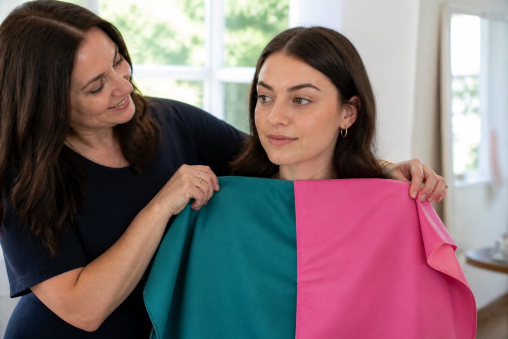
Real analysis works differently: a consultant drapes fabric swatches under your chin in natural light and watches how your skin, eyes, and hair respond. Colors that fight your undertone cast shadows; colors that harmonize brighten your face without makeup.
The Science Behind Skin Undertones and Seasonal Palettes
Skin undertone is the underlying hue beneath your skin’s surface, and it stays constant even when your surface tone changes with sun or season. Undertones are warm (golden, peachy, yellow), cool (pink, red, blue), or neutral (a balance of both).
Seasonal palettes build on that foundation. The four-season system groups people into Spring, Summer, Autumn, and Winter based on three dimensions: undertone, color value (how light or dark your natural features are), and color intensity (how bright or muted).
- Spring: warm undertone, light features, bright colors
- Summer: cool undertone, light features, soft colors
- Autumn: warm undertone, deep features, muted colors
- Winter: cool undertone, deep features, high-contrast colors
The system maps to how light reflects off your skin, which is why the right colors make you look rested and the wrong ones make you look tired.
The Benefits of Personal Color Analysis for Your Career
The benefits of personal color analysis extend beyond looking put-together. Knowing your palette reduces decision fatigue, cuts spending on clothes you never wear, and builds the visual credibility that shapes how colleagues read you.
Consider a typical workweek: you pull on a blouse, something feels off, you change, you’re late. Multiply that friction across a career and it becomes a quiet tax on your confidence.
A capsule wardrobe built on your palette eliminates most of that friction: every piece works with every other because they share an underlying color logic. You buy less and wear more.
Personal branding is partly visual. When your clothing, jewelry, and makeup sit in the same color family, people perceive you as intentional, and that perception compounds.
Key Takeaway
The real return on color analysis isn’t a prettier wardrobe. It’s removing the daily friction of “what do I wear” so your energy goes toward the work itself.
The real return on color analysis isn’t a prettier wardrobe. It’s removing the daily friction of “what do I wear” so your energy goes toward the work itself.
Best Colors to Wear for Job Interviews
The best colors to wear for job interviews are navy, charcoal, and deep burgundy for most candidates, with softer neutrals like taupe, olive, and slate working well in creative or casual industries. They read as competent and calm without pulling attention from you.
The specific shade matters less than the fit with your undertone. A cool-toned navy flatters cool undertones; a warm, green-leaning navy flatters warm undertones. Both are “navy.” Only one makes you look alive.
Here’s a practical shortlist for interview dressing:
- Navy, the safest high-impact choice across industries
- Charcoal or soft black, strong for formal and finance roles
- Burgundy or deep plum, adds warmth without shouting
- Forest or olive green, grounded and approachable
- Cream or soft white, better than stark white for most warm undertones
Avoid neon, high-saturation brights, and busy prints. They compete with your face for attention in a room where you want the focus on what you’re saying.
The Career ROI of Getting Your Interview Colors Right
Most color analysis content stops at “wear navy, look polished,” treating color as decoration. The more useful framing: interview color is a perception lever you control before you say a word, and perception levers compound.
In the first few seconds of an interview, before your handshake lands, the interviewer is already forming a read on your competence, warmth, and status. Research on thin-slicing suggests those reads are sticky, and color is one of the few variables in that window you can engineer. A palette that harmonizes with your undertone makes skin look even and eyes alert, reading as “rested and credible”; a palette that fights it reads as “tired.”
That gap matters most in the moments where career leverage is decided:
- Interviews and screenings. A hiring manager comparing two equally qualified candidates is often deciding on fit and presence. Looking healthy and intentional is a tiebreaker.
- Salary conversations. Negotiation research finds that perceived confidence and composure predict who asks for more and who gets it. Wearing colors you know flatter you removes self-consciousness that leaks into your voice and posture.
- Promotion readiness. Managers promote people they can picture in the next role. Dressing in your palette signals that you already see yourself there.
- Client-facing and leadership moments. When your visual presentation is coherent, you’re read as the person in charge.
None of this is a guarantee, color analysis is not a substitute for competence, preparation, or a strong resume. It removes a variable that quietly works against people who never think about it. The honest ROI framing: color analysis can be a valuable investment relative to a single missed opportunity, and the payoff can spread across every high-stakes room you walk into.
Key Takeaway
Treat your interview palette the way you treat your resume: as a controlled input to an outcome you care about. You can’t script the interviewer’s questions, but you can decide what they see first.
Treat your interview palette the way you treat your resume: as a controlled input to an outcome you care about. You can’t script the interviewer’s questions, but you can decide what they see first.
How to Apply the 70/20/10 Rule for Professional Color Coordination
The 70/20/10 rule is a proportion guideline: 70 percent of your outfit in a dominant neutral, 20 percent in a secondary color, and 10 percent in an accent. It’s the fastest way to look coordinated without overthinking.
| Outfit Layer | Share | Example |
|---|---|---|
| Dominant neutral | 70% | Navy suit or charcoal trousers |
| Secondary color | 20% | Cream blouse or soft grey knit |
| Accent | 10% | Burgundy scarf or gold earrings |
The ratio works because it gives the eye a clear hierarchy: when three colors compete equally, the outfit looks busy; when one leads, the look reads as deliberate.
If you’re returning to work after time away, pick one dominant neutral that flatters you, build your wardrobe base around it, and let the 20 and 10 percent do the personality work.
Dressing for Video Interviews and Remote Work
On-camera color behaves differently than in-person color, and it’s an important consideration since a growing share of interviews and meetings now happen through a webcam.
Three things change on video:
- Compression flattens contrast. Webcam compression softens the difference between your darkest and lightest features, so a high-contrast outfit that reads as authoritative in person can look muddy on screen.
A few practical rules for remote and hybrid professionals:
Pro Tip
If you have a video interview, do a full dress rehearsal on the platform you’ll use. Colors that look great in a mirror can shift under a specific webcam’s white balance, and you want to discover that before the call, not during it.
If you have a video interview, do a full dress rehearsal on the platform you’ll use. Colors that look great in a mirror can shift under a specific webcam’s white balance, and you want to discover that before the call, not during it.
Color Psychology in the Workplace: How Color Affects Perception and Performance
Pro Tip
If you have a high-stakes presentation, wear your highest-contrast outfit from your palette. The visual sharpness reads as confidence before you say a word.
If you have a high-stakes presentation, wear your highest-contrast outfit from your palette. The visual sharpness reads as confidence before you say a word.
The Mechanism: Why Color Reads Before You Speak
Color Psychology for Remote and Hybrid Work
Color Psychology Across Diverse Skin Tones
Watch Out
If a color analysis resource tells you what colors suit “dark skin” or “light skin” as a category, consider that undertone, value, and intensity are individual, not categorical.
If a color analysis resource tells you what colors suit “dark skin” or “light skin” as a category, consider that undertone, value, and intensity are individual, not categorical.
Matching Contrast to the Room
Professional vs. DIY Color Analysis: What to Expect and How to Choose
A professional color consultation typically follows this structure:
| Factor | DIY Quiz | Professional Analysis |
|---|---|---|
| Time required | 10-15 minutes | 1-2 hours |
| Accuracy | Depends on self-assessment | Trained observation |
| Lighting control | None | Natural daylight |
| Cost | Free | Varies; see website for details |
| Follow-up support | None | Palette reference materials |
Building a Capsule Wardrobe Around Your Color Palette
Frequently Asked Questions
Is professional color analysis worth it for job seekers?
Yes, if you want to remove guesswork from your interview wardrobe. A professional color analysis identifies which colors make you look healthy and confident, so you stop buying clothes that wash you out. For job seekers, this means fewer wasted purchases and a polished appearance that supports your personal branding. The benefits of personal color analysis extend beyond interviews to daily professional attire, helping you build a cohesive wardrobe that reinforces your executive presence.
What colors are best for job interviews to convey authority?
Navy blue and charcoal gray are the most reliable choices for conveying authority across industries. These colors project competence without distracting from your face. If your skin undertone is warm, opt for a navy with slight green undertones; if cool, choose a blue-based navy. Pair with a crisp white or soft cream top. The best colors to wear for job interviews are those within your seasonal palette that also align with the formality of the workplace culture.
How does color psychology influence hiring decisions?
Research in color psychology shows that people form impressions within seconds, and color plays a role in that snap judgment. Blue often signals trust and reliability, while red can suggest confidence or aggression depending on context. Wearing colors that harmonize with your natural features makes you appear more approachable and credible. Understanding color psychology in the workplace helps you choose attire that supports the impression you want to make, whether you are leading a meeting or meeting a client.
Can a professional color analysis change your professional wardrobe strategy?
A professional color analysis gives you a defined palette that simplifies shopping and outfit coordination. Instead of buying random pieces, you build a capsule wardrobe where every item works together. This reduces decision fatigue and ensures you always look put-together. Many clients find they need fewer clothes because each piece earns its place. The result is a wardrobe that supports your career goals and reflects your authentic self.